CSS Flexbox 101


This blog explains the basics of CSS Flexbox through code snapshots and screenshots of the outcomes.
CSS Flexbox is a CSS3 web layout model that allows elements within a container to be automatically arranged depending on the screen size.
We will be looking at CSS Flexbox through the following steps and FAQs:
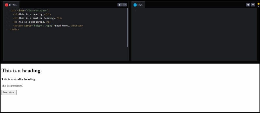
1) Establishing the HTML flow of the container.
2) What happens when the container is assigned the display property of 'flex'?
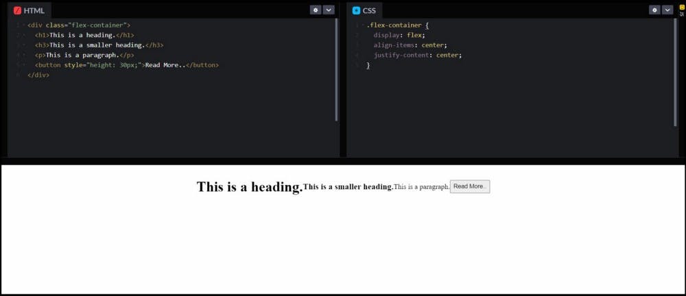
The elements are arranged in a horizontal order by default.
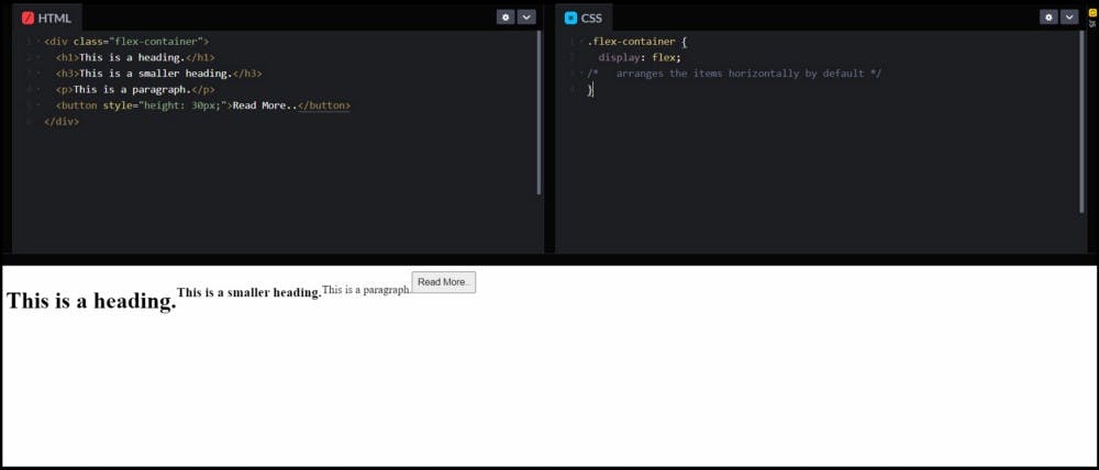
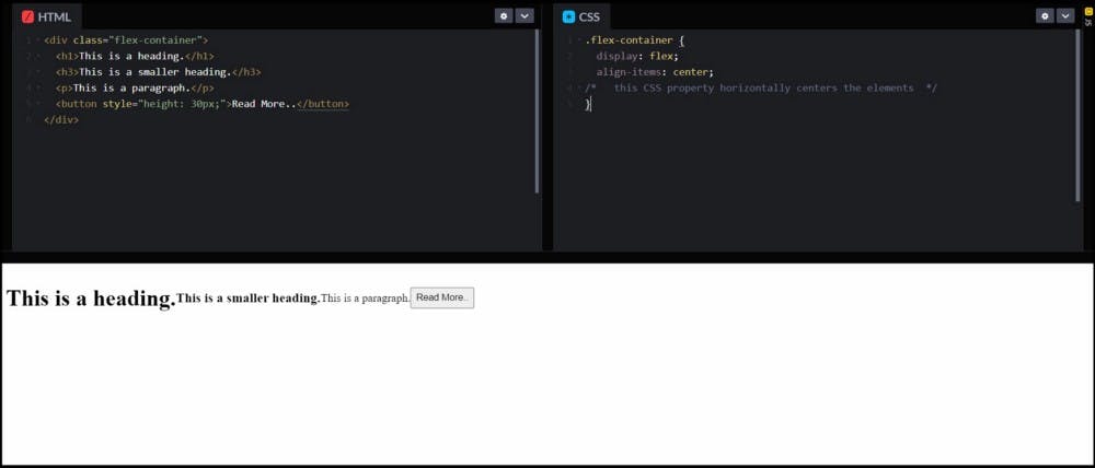
3) As we can see in the above picture, the 'display: flex' arranges the elements in a horizontal manner by default, but how do I center these elements?
We can horizontally center the elements by using the following CSS property: 'align-items: center'

4) We've achieved horizontal centering, but how do I get them to the middle of my screen? How do I vertically center them?
The elements can be vertically centered by using the following CSS property: 'justify-content: center'.
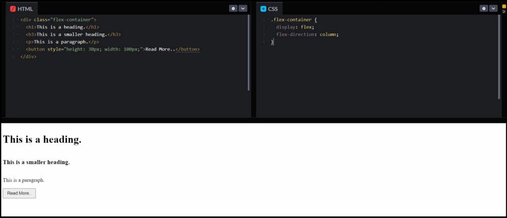
5) What do I need to do if I want to arrange the elements in a vertical fashion?
The elements can be vertically arranged by changing the following property: 'flex-direction: row' (default) to 'flex-direction: column'.
6) Do the CSS properties stay the same even after changing the 'flex-direction' to 'column'?
The answer is NO! Their roles are switched. Now, the 'align-items' property is used for vertical centering and 'justify-content' is used for horizontal centering.
These are all the basics that you need to know about CSS Flexbox before you set out to master them.
A more advanced class on CSS Flexbox by freeCodeCamp.org can be found here. 👇